

A couple of words on polymorphism
As developers strive to make their code more flexible, maintainable, and scalable, they often encounter the concept of polymorphism. In Angular, polymorphism can be applied to views, enabling the same template to dynamically adapt its structure and behavior based on different conditions. To understand what polymorphism looks like in templates, it’s helpful to start by recognizing what it is not. If introducing new requirements to your view results in any of the following scenarios, it's a sign that your code might not be truly polymorphic:
- Adding New Property Flags: You find yourself adding property flags like
shouldDisplayTooltip,isCardVisible, orisCollapsibleto control various aspects of the view:
@if(isCardVisible) {
<mat-card>
  @if(isHeaderVisible) {
    <mat-card-header>
      <mat-card-title>Title</mat-card-title>
    </mat-card-header>
  }

  <mat-card-content [matTooltip]="shouldDisplayTooltip ? 'tooltip text' : null"> Card content </mat-card-content>
</mat-card>
}
- Relying Heavily on
iforswitchStatements: Your view depends heavily on conditional logic to display different elements:
@switch(true) {
  @case(viewMode === 'list') {
    <app-list-view></app-list-view>
  } @case(viewMode === 'grid') {
    <app-grid-view></app-grid-view>
  } @case(viewMode === 'detail') {
    <app-detail-view></app-detail-view>
  }
}
- Hardcoding Multiple Versions of a View: You’re creating multiple versions of the same view to handle different scenarios:
<mat-card>
  <mat-card-header>
    <mat-card-title>Title</mat-card-title>
  </mat-card-header>
  <mat-card-content>
    @if(isCollapsible) {
      <cdk-accordion
          <cdk-accordion-item>
            Collapsible content
          </cdk-accordion-item>
      ><cdk-accordion>
    } @else {
      Non-collapsible content
    }
  </mat-card-content>
</mat-card>
The main difference between polymorphic and non-polymorphic views is that changes to polymorphic views don’t require alterations to the core implementation of the view. This makes the templates more flexible and easier to maintain and expand over time.
In this article, we'll explore what polymorphic views are, how they differ from the traditional (imperative) way of creating views. We’ll also explore how recent Angular features have breathed new life into this approach and what fantastic opportunities these features offer us.
Dynamic views in Angular
As previously mentioned, polymorphism in templates occurs when a view dynamically adapts its structure and behavior based on different conditions. Although dynamic views and polymorphic views are not the same, dynamic rendering in templates facilitates the use of polymorphism. Angular provides several built-in mechanisms to support this, including interpolation, the ngTemplateOutlet directive for templates, and the ngComponentOutlet directive for components. In this article, we will focus primarily on the latter.
NgComponentOutlet
The ngComponentOutlet directive was initially introduced in Angular 4. It enables dynamic rendering of components in Angular templates by allowing a developer to specify a component type at runtime.
With Angular's Ivy engine, creating dynamic components has become much simpler. Gone are the days of needing ComponentFactoryResolver, entryComponents, adding lazy-loading modules to angular.json files, and dealing with the famous injector issue while lazy-loading modules.
Ivy allows developers to render components without these cumbersome requirements dynamically. The ngComponentOutlet directive now supports on-the-fly component creation, making the process more efficient and straightforward.
Communicating with dynamic components
Rendering a component dynamically is just one piece of the puzzle; the real challenge often lies in efficiently passing input data to these components and handling their output events, all while maintaining strict type safety.
Angular's Built-in Tools
To partially address these challenges, Angular 14 introduced two key features that simplify working with dynamic components:
setInputmethod onComponentRefClass: This method provides a more streamlined way to set inputs on dynamically created components. It works seamlessly with both traditional inputs defined using the@Inputdecorator and the newer signal inputs. This method ensures that the inputs are correctly bound to the component, triggering Angular's change detection automatically:
@Component({
  ...
})
export class MyComponent {
  private readonly vcr = inject(ViewContainerRef);

  private createComponent(): void {
    const componentRef = this.vcr.createComponent(
      MyDynamicComponent
    );

    componentRef.setInput('name', 'Bob');
  }
}
ngComponentOutletInputsInput Property onNgComponentOutletdirective: This property allows you to pass an object containing input values directly to a dynamically rendered component via theNgComponentOutletdirective. The inputs provided this way are properly bound to the component instance, and change detection is automatically managed, ensuring that components using theOnPushstrategy are marked for check when necessary:
@Component({
  ...
})
export class MyComponent {
  component = MyDynamicComponent;
  inputs = { data: 'Dynamic Data' };
}
<ng-container *ngComponentOutlet="component; ngComponentOutletInputs: inputs"></ng-container>
Both of these approaches greatly simplify the process of working with dynamic components, especially in terms of managing change detection and lifecycle hooks. However, they do not inherently provide strict type safety. Developers still need to manually ensure that the correct types are being passed to these inputs, as Angular does not enforce this at compile time. This leaves room for potential errors.
The situation is more straightforward with outputs, as we can simply access them through the component instance, subscribe to them, and maintain correct typing:
const componentRef = this.vcr.createComponent(MyDynamicComponent);

componentRef.instance.onEdit.subscribe((value) => {
  // Handle an emitted event
});
Using Dependency Injection Tokens
Another approach for passing data involves using dependency injection (DI) tokens, a technique exemplified by the ng-polymorpheus library. This method partially addresses typing issues by allowing you to define an interface for the expected input data. Here's how it works:
  interface MyDynamicComponentContext {
    name: string;
    onEdit: (value: string) => void;
  }

  @Component({
    ...
  })
  export class MyDynamicComponent {
    private readonly context = inject<MyDynamicComponentContext>(POLYMORPHEUS_CONTEXT);
  }
Next, you render the component in your template with the dedicated polymorpheusOutlet directive, passing the required context:
  @Component({
    ...
  })
  export class MyComponent {
    public readonly component = new PolymorpheusComponent<MyDynamicComponent>(MyDynamicComponent);
    public readonly context: MyDynamicComponentContext = { name: 'Bob', onEdit: (value: string) => this.onEdit(value) };

    private onEdit(value: string): void {
      ...
    }
  }
<ng-container *polymorpheusOutlet="content; context: context"></ng-container>
The PolymorpheusComponent class serves as a wrapper around your actual component, allowing for dynamic rendering with context injection:
export class PolymorpheusComponent<T> {
  constructor(public readonly component: Type<T>, private readonly i?: Injector) {}

  public createInjector<C>(injector: Injector, useValue?: C): Injector {
    return Injector.create({
      parent: this.i || injector,
      providers: [
        {
          provide: POLYMORPHEUS_CONTEXT,
          useValue,
        },
      ],
    });
  }
}
While this approach provides a powerful way to pass context data, it can reduce component flexibility because the components are specifically designed to be rendered using this method. Consequently, these components may not be as easily reusable with standard input and output properties. Although it is possible to duplicate properties to support both scenarios, doing so introduces additional complexity. Moreover, this approach does not enforce type safety when passing contex.
Signal inputs and outputs - the missing part of the puzzle
Looking back at everything we've discussed so far in this article, it's clear that Angular historically lacked an automatic method for identifying and inferring the types of component inputs. Unlike frameworks like React, where the functional component architecture naturally incorporates the arguments as inputs—making prop type inference straightforward—Angular faced challenges in this area. Traditionally, while Angular could manage output identification via EventEmitter, distinguishing input properties from other public properties within components wasn’t automatically feasible.
This limitation has been significantly addressed with the introduction of signal inputs. By utilizing the input function to create these signal inputs, they are explicitly typed as InputSignal, making it possible to identify them and infer their types:
export type ExtractInputSignalsValues<T extends object> = OmitNever<{
  [Key in keyof T]: T[Key] extends InputSignal<infer ValueType> ? ValueType : never;
}>;

export type PolymorphicComponentInputs<TComponent extends Type<any>> = ExtractInputSignalsValues<InstanceType<TComponent>>;
Similarly, for outputs, Angular has enhanced its functionality with the introduction of the output function. Outputs created this way are of the OutputEmitterRef type:
export type ExtractOutputEmitterRefs<T extends object> = OmitNever<{
  [Key in keyof T]: T[Key] extends OutputEmitterRef<infer ValueType> ? OutputEmitterRef<ValueType> : never;
}>;
Now, we can easily create a wrapper around our component classes to encapsulate the actual component and facilitate the pre-passing of the component's inputs and outputs:
export class PolymorphicComponent<TComponent extends Type<any> = Type<any>> {
  public readonly inputs: ValueOrNever<PolymorphicComponentInputs<TComponent>>;
  public readonly outputsHandlers: ValueOrNever<Partial<PolymorphicComponentOutputsHandlers<TComponent>>>;

  constructor(public readonly component: TComponent, private readonly params: PolymorphicComponentParams<TComponent>) {
    this.inputs = getInputsFromParams(this.params);
    this.outputsHandlers = getOutputHandlersFromParams(this.params);
  }
}
When the component is rendered in a template with a dedicated directive, the necessary inputs and outputs are correctly propagated to the encapsulated component.
Enough theory, let’s see this in action
To create a polymorphic component, we are instantiating the PolymorphicComponent class and pass a component class to it with inputs and outputs:
@Component({
  selector: 'my-icon',
  ...
})
export class IconComponent {
  public readonly icon = input<string>();

  public readonly iconClicked = output<void>();
}

const iconComponent = new PolymorphicComponent(
  IconComponent,
  {
    inputs: {
      icon: 'search'
    },
    outputsHandlers: {
      iconClicked: () => {
        console.log('Clicked')
      }
    }
  }
);
To render a polymorphic component in a template, you need to use the polymorphicComponentOutlet directive and pass the component to it:
export class MyComponent {
  public readonly iconComponent = iconComponent;
}
<ng-container *polymorphicComponentOutlet="iconComponent"></ng-container>
In cases where you want to override previously provided inputs or add additional output handlers directly via the template, or when inputs are intended to be passed through the template rather than upfront, you can utilize the polymorphicComponentOutletInputs and polymorphicComponentOutletOutputsHandlers inputs defined on the polymorphicComponentOutlet directive:
@Directive({
  standalone: true,
  selector: '[polymorphicComponentOutlet]',
})
export class PolymorphicComponentOutletDirective<TComponent extends Type<any>> {
  public readonly polymorphicComponent = input.required<PolymorphicComponentOrFactory<TComponent>>();

  public readonly polymorphicComponentOutletInputs = input<Partial<PolymorphicComponentInputs<TComponent>>>();
  public readonly polymorphicComponentOutletOutputsHandlers = input<Partial<PolymorphicComponentOutputsHandlers<TComponent>>>();
Now, we can ensure correct typing at compilation time and prevent potential issues during execution. This allows for a dynamic and flexible way to manage component data and interactions directly from the template:
<ng-container *polymorphicComponentOutlet="iconComponent; inputs: inputs; outputsHandlers: outputHandlers"></ng-container>
To enhance autocomplete functionality while defining inputs and outputs for components, we can utilize the createInputsFor and createOutputsHandlersFor functions. These functions ensure that input and output handlers are correctly typed based on the component passed as the first argument, thereby providing accurate autocomplete suggestions:
@Component({
  ...
  imports: [PolymorphicComponentOutletDirective],
})
export class MyComponent {

  public readonly iconComponent = iconComponent;

  public readonly overriddenInputs = createInputsFor(IconComponent)({
    icon: 'delete',
  });

  public readonly additionalOutputHandlers = createOutputsHandlersFor(IconComponent)({
    iconClicked: () => {
      console.log('Handle the click here as well');
    },
  });
}
By distinguishing input signals from other component properties, we can create interfaces that our components implement. This approach enables us to decouple our code from specific component classes and rely on an interface instead, which is the essence of polymorphism. It allows us to handle inputs and outputs without needing to know the exact class being used:
interface IconComponent {
  icon: InputSignal<string>;
  iconClicked: OutputEmitterRef<void>;
}

@Component({
  ...
})
export class MyIconComponent implements IconComponent {
  public readonly icon = input<string>();
  public readonly iconClicked = output<void>();
}
You can use a type helper function to easily pass type information as a parameter:
export const type = <T>(): T => ({} as T);

@Component({
  ...
})
export class MyComponent {
  public readonly iconComponent: Type<IconComponent>;

  public readonly overriddenInputs = createInputsFor(type<Type<IconComponent>>())({
    icon: 'delete',
  });

  public readonly additionalOutputHandlers = createOutputsHandlersFor(type<Type<IconComponent>>())({
    iconClicked: () => {
      console.log('Handle the click here as well');
    },
  });
}
The key point to remember is that components can now be rendered traditionally or via the polymorphicComponentOutlet directive, while still allowing for input handling, output management, and ensuring strict type safety:
<!-- Render a component using its selector -->
<my-icon icon="search" (iconClicked)="onIconClicked()"></my-icon>

<!-- Dynamically render a component using the polymorphicComponentOutlet directive  -->
<ng-container *polymorphicComponentOutlet="iconComponent; inputs: inputs; outputsHandlers: outputHandlers"></ng-container>
Thus, we finally have a way to ensure strict type safety while working with dynamic components' inputs and outputs.
Providing async values for inputs
Observables or signals can be passed as input values. Any emitted changes will be propagated accordingly, and the change detection process will be triggered:
const icon$ = of('value as observable');

const iconComponent = new PolymorphicComponent(IconComponent, {
  inputs: {
    icon: icon$,
  },
});

const $icon = signal('value as signal');

const iconComponent = new PolymorphicComponent(IconComponent, {
  inputs: {
    icon: $icon,
  },
});
With the introduction of signals in Angular, it's advantageous when a solution supports both observables and signals, handling the transformations seamlessly under the hood. This dual compatibility ensures that dynamic components can interact with data streams efficiently, regardless of the source type, and enhances the adaptability of the code to different reactive programming scenarios.
Bringing Functional Components to Angular
To efficiently generate multiple instances of the same component with varied settings, using the createPolymorphicComponent function is ideal due to its support for currying:
export const createPolymorphicComponent = <TComponent extends Type<any>>(
  component: TComponent
): PolymorphicComponentFactory<TComponent> => {
  return (params?: PolymorphicComponentParams<TComponent>) => {
    return new PolymorphicComponent(component, (params ?? {}) as PolymorphicComponentParams<TComponent>);
  };
};
Here’s how it works:
const createIconComponent = createPolymorphicComponent(IconComponent);

const iconOne = createIconComponent({
  inputs: {
    icon: 'search',
  },
});

const iconTwo = createIconComponent({
  inputs: {
    icon: 'info',
  },
});
By defining a curried function createIconComponent, you can easily configure multiple instances of IconComponent with varying inputs. While Angular does not natively support functional components in the traditional sense seen in frameworks like React, the ability to automatically infer input types has opened the door for creating custom adapters like createPolymorphicComponent. This tool allows us to employ a functional programming style by managing and instantiating components through function factories, thus enhancing both the flexibility and reusability of Angular components. For instance, the partial function can be used to decompose the process of passing inputs into multiple phases:
import { createPolymorphicComponent, partial } from '@shared/util-polymorphic-content';

@Component({
  ...
})
export class IconComponent {
  public readonly icon = input<string>();
  public readonly direction = input<IconDirection>();
  public readonly color = input<ThemePalette>();
}

const createIconComponent = createPolymorphicComponent(IconComponent);
const createIconComponentPartial = partial(createIconComponent);

const createSearchIcon = createIconComponentPartial({
  inputs: {
    icon: 'search',
  },
});

const searchIcon = createSearchIcon({
  inputs: {
    direction: 'before',
    color: 'accent',
  },
});
Polymorphic Views Composition
The essence of polymorphism lies in its ability to offer highly flexible composition and customization. Let's delve into how this can be implemented by starting with the definition of a PolymorphicContent type. This type is designed to handle various forms of content—whether it's a component, template, string, or any other primitive:
export type TemplateWithContext<T> = {
  templateRef: TemplateRef<T>;
  context: T;
};

export type ValueOrReactive<TValue> =
  | TValue
  | Observable<TValue>
  | Signal<TValue>;

export type PolymorphicPrimitive =  ValueOrReactive<number | string | null | undefined>;

export type PolymorphicContent<T> = PolymorphicComponent<Type<T>> | TemplateWithContext<T> | PolymorphicPrimitive;
Following this, we define an interface that our wrapper components will adhere to. This interface ensures that any component tasked with wrapping or enhancing content maintains a consistent structure for managing the polymorphic content input:
export interface WithPolymorphicContent<T = any> {
  content: InputSignal<PolymorphicContent<T>>;
}
Finally, let's create the polymorphic-outlet component, which will act as the rendering point for any form of content, whether it be a component, a template, a string, etc. This component leverages Angular’s dynamic rendering capabilities to adaptively display content based on its type:
@Component({
  standalone: true,
  selector: 'polymorphic-outlet',
  imports: [PolymorphicComponentOutletDirective, NgTemplateOutlet],
})
export class PolymorphicOutletComponent<T = any> implements WithPolymorphicContent<T> {
  public readonly content = input<PolymorphicContent<T>>();
}

export const polymorphicOutlet = createPolymorphicComponent(PolymorphicOutletComponent);
@switch (true) {
  @case (isComponent()) {
    @if (asComponent(); as component) {
      <ng-container *polymorphicComponentOutlet="component"></ng-container>
    }
  }

  @case (isTemplate()) {
    @if (asTemplate(); as template) {
      <ng-container
        [ngTemplateOutlet]="template.templateRef"
        [ngTemplateOutletContext]="template.context"
      ></ng-container>
    }
  }

  @default {
    {{ asPrimitive() }}
  }
}
Now, let's develop several wrapper components designed to accept content and enhance it with additional visual elements or behaviors. These components will implement the WithPolymorphicContent interface, ensuring they possess a content input of the type InputSignal<PolymorphicContent<T>>. Each component will utilize the previously defined polymorphic-outlet in their templates to dynamically render the provided content:
Badge component:
@Component({
  ...
})
export class WithBadgeComponent<T> implements WithPolymorphicContent<T> {
  public readonly content = input<PolymorphicContent<T>>();
  ...// other inputs
}
<span [matBadge]="badge()" [matBadgeOverlap]="overlap()" [matBadgePosition]="position()">
  <ng-content><polymorphic-outlet [content]="content()"></polymorphic-outlet></ng-content>
</span>
Icon component:
@Component({
  ...
})
export class WithIconComponent<T> implements WithPolymorphicContent<T> {
  public readonly content = input<PolymorphicContent<T>>();
  ...// other inputs
}
<mat-icon [color]="color()" (click)="iconClicked.emit()">{{ icon() }}</mat-icon> <ng-content><polymorphic-outlet [content]="content()"></polymorphic-outlet></ng-content>
Tooltip component:
@Component({
  ...
})
export class WithTooltipComponent<T = any> implements WithPolymorphicContent<T> {
  public readonly content = input<PolymorphicContent<T>>();
  ...// other inputs
}
<span [matTooltip]="text()" [matTooltipPosition]="position()">
  <ng-content><polymorphic-outlet [content]="content()"></polymorphic-outlet></ng-content>
</span>
Angular 18 introduced a powerful new feature that allows us to pass a fallback value for the ng-content component:
<ng-content><polymorphic-outlet [content]="content()"></polymorphic-outlet></ng-content>
This feature significantly enhances the flexibility of content projection in Angular. It allows your components to handle both scenarios: projecting content directly via the content input or using Angular's standard content projection mechanism.
For example, you can now easily support scenarios where content is provided within the template:
<with-icon> Content </with-icon>
Or where the content is passed programmatically through the component's content input:
createIconComponent({
  inputs: {
    content: 'Content',
  },
});
Finally, let's define a function to streamline the composition of views by iterating over a list of wrapper components. Using the reduce function, we can apply each wrapper sequentially, thereby enclosing a given content (whether it be a component, template, or string) within all specified wrappers. This method offers extensive customization options, making it easy to combine multiple wrappers around any piece of content:
export const composePolymorphicWrappers = (
  ...wrappers: Array<PolymorphicComponentFactory<Type<WithPolymorphicContent>>>
) => {
  return (content: PolymorphicContent<any>): PolymorphicContent<any> => {
    return wrappers.reduce(
      (acc, curr) =>
        curr({
          inputs: {
            content: acc,
          },
        }),
      content
    );
  };
};
Putting It All Together
Let's consolidate everything discussed so far with a practical example.
In this implementation, each wrapper component—Badge, Tooltip, and Icon—is instantiated partially, with specific input properties set upfront:
const withIcon = createWithIconComponentPartial({
  inputs: {
    icon: 'delete',
  },
  outputsHandlers: {
    iconClicked: () => {
      inject(MatSnackBar).open('Icon clicked');
    },
  },
});

const withBadge = createWithBadgeComponentPartial({
  inputs: {
    badge: 'Polymorphic',
    position: 'above after',
  },
  className: 'd-inline-flex',
});

const withTooltip = createWithTooltipComponentPartial({
  inputs: {
    position: 'above',
    text: 'Polymorphic tooltip',
  },
  providers: [
    {
      provide: MAT_TOOLTIP_DEFAULT_OPTIONS,
      useValue: {
        disableTooltipInteractivity: false,
      },
    },
  ],
});
These initial configurations generate factory functions, which are then coordinated using the composePolymorphicWrappers function. This function iterates over an array of wrappers and passes each wrapper itself as the content input to the next wrapper in the sequence, culminating in a composite structure. The final step involves passing a specific value to the wrapContent function, which then gets wrapped by the combined wrappers:
  @Component({
    ...
    imports: [PolymorphicOutletComponent],
  })
  export class MyComponent {
  public readonly polymorphicView = this.getPolymorphicView();

  private getPolymorphicView(): PolymorphicContent<unknown> {
    const wrappers: Array<PolymorphicComponentFactory<Type<WithPolymorphicContent>>> = [
      withBadge,
      withTooltip,
      withIcon
    ];

    const wrapContent = composePolymorphicWrappers(...wrappers);

    return wrapContent('Content');
  }
}
Finally, the polymorphicView is rendered through the polymorphic-outlet component:
<polymorphic-outlet [content]="polymorphicView"></polymorphic-outlet>
Polymorphic vs. Imperative
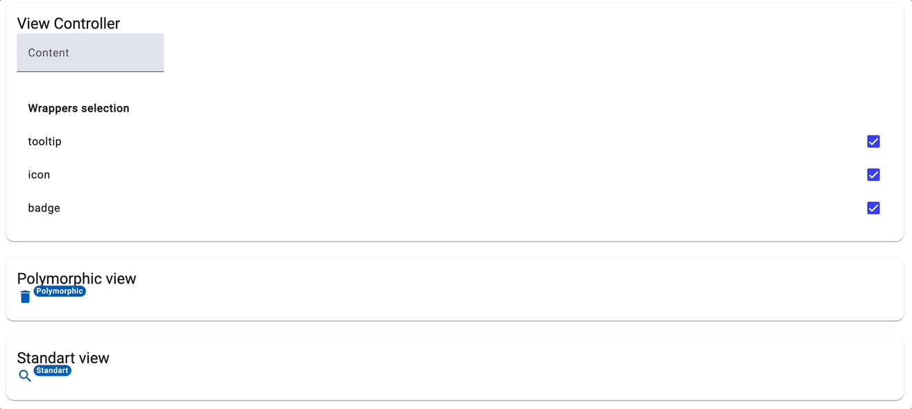
Let's compare the traditional imperative approach with the polymorphic approach in the following example:
<!-- Polymorphic view -->
<polymorphic-outlet [content]="polymorphicView"></polymorphic-outlet>

<!-- Standard view -->
<with-badge badge="Standart" position="above after">
  <with-icon icon="search" (iconClicked)="onIconClicked()">
    <with-tooltip text="Standart tooltip" position="above">
      <span> Content </span>
    </with-tooltip>
  </with-icon>
</with-badge>
The imperative approach, while straightforward, centralizes all logic within the component itself, which can make maintenance difficult as the codebase expands and components grow in complexity. In contrast, the polymorphic approach, by distributing logic across multiple locations, promotes a more flexible architecture that simplifies maintenance through better separation of concerns.
Furthermore, the polymorphic method supports dynamic runtime modifications—like reordering components or altering the composition of wrappers—that are unfeasible with the imperative approach. This adaptability is particularly beneficial for complex applications requiring high levels of customization.
Modularity of Polymorphic Components with Dynamic Injection Context Binding Using runInInjectionContext:
Upon revisiting the creation of the icon component, we observe that dependencies are injected directly in the handler function:
const ICON = createWithIconComponentPartial({
  inputs: {
    icon: 'delete',
  },
  outputsHandlers: {
    iconClicked: () => {
      inject(MatSnackBar).open('Icon clicked');
    },
  },
});
This direct injection is made feasible because the output handlers are invoked within the runInInjectionContext during component rendering with the polymorphicComponentOutlet directive and a value is emitted:
 private propagateOutputValue(...): void {
  ...
  runInInjectionContext(this.injector, () => {
    outputHandlers.forEach((handler) => {
      handler(emittedValue);
    })
  });
The runInInjectionContext helper function in Angular empowers execution within a specified injection context, permitting the use of Angular's Dependency Injection (DI) system without being confined to any particular component or injectable class. Such an approach fosters the creation of standalone features that dynamically leverage DI during execution, enhancing both modularity and flexibility. In the realm of polymorphic views, it allows components to dynamically resolve dependencies, thereby ensuring they remain independent, highly adaptable, and reusable across varied contexts.
Conclusion
While the title of this article may have hinted at introducing Functional Components in the style seen in frameworks like React, it's evident that Angular hasn't adopted this paradigm. Nevertheless, the capability to automatically infer input types through signal inputs offers exciting new possibilities. This feature invites us to reimagine component creation in Angular, embracing a hybrid approach that merges class-based components with elements of functional programming, such as currying, partial application, and function composition, enhancing our ability to manage polymorphic views.
The benefits of this approach—increased flexibility, improved reusability, simplified composition, and enhanced customization—have been consistently emphasized throughout this article. Additionally, the dynamic injection context binding with runInInjectionContext further bolsters this method, enabling the development of more standalone and modular components.
Importantly, all these advancements are achieved while preserving strict type safety, a feature still underdeveloped in Angular’s native API for dynamic components. This ongoing evolution opens the door for potential future developments by the Angular team, possibly including native support for functionalities like asFunctionalComponent, who knows.
Showcase
Source code
Here are some references where you can find more information about polymorphic components, polymorphic outlets, and a showcase component in Angular: