

As an Angular developer, you're probably aware of the numerous UI libraries available, such as Angular Material, PrimeNG, Clarity, NG Bootstrap, Kendo UI, Taiga UI, daisyUI and Spartan. While these libraries have their strengths, in this blog post, we'll explore why PrimeNG stands out as a rich and versatile choice for your Angular projects.
What is PrimeNG?
PrimeNG is an extensive collection of rich UI components for Angular. It’s developed by PrimeTek Informatics, a company with years of expertise in developing open-source UI component libraries. PrimeNG is also a sibling of the popular popular UI library such as JavaServer Faces, PrimeReact and PrimeVue.
One of the key advantages of using a UI library such as PrimeNG is the speed it brings to your development process. It allows you to quickly prototype and build application without having to create complex UI components from scratch.
Now, let's start the process of setting up PrimeNG in your Angular project.
Setting up your Angular project with PrimeNG
In this part, we will explore how to add PrimeNG and its dependencies to your Angular project, import the necessary styles, and utilize PrimeNG components in your templates.
Installing PrimeNG
Before starting to integrate PrimeNG into your Angular project, make sure that you set up a fresh project to begin with. If not, you can create a new project by running the following command:
npx @angular/cli new
You can also add PrimeNG to your existing project. Please check the version comparability at https://primeng.org/lts. Basically, PrimeNG release cycle does match with Angular 6 months release cycle. If you are using Angular v15, you should install PrimeNG v15 to avoid breaking changes.
Now follow these steps to install PrimeNG in your Angular project:
- Open a terminal or command prompt in your project directory.
- Run the following command to install PrimeNG and save it as a dependency in your project:
npm install primengAfter the installation process, we will primeng in the package.json file in your root directory.
The primeng package is all that you need to get started with integration. In the next section, we will add some styles and themes to your application.
Note: In this post, we'll utilize Angular & PrimeNG version 17 for demo purpose.
Importing PrimeNG styles into your Angular application
The Theme and Core styles are essential CSS files for the components. You can find the comprehensive selection of available themes in the Theming section at https://primeng.org/theming#themes. To incorporate the styles, you can import them either in the angular.json or src/styles.css file. In this section, we will utilize the lara-light-blue theme as a demonstration.
// styles.scss

/* You can add global styles to this file, and also import other style files */
@import 'primeng/resources/themes/lara-light-blue/theme.css';
@import 'primeng/resources/primeng.css';
In addition, each theme has its own font family, it's suggested to apply it to your application to achieve a unified look.
// styles.scss

body {
  font-family: var(--font-family);
}
Using PrimeNG components in your templates
The section focuses on incorporating PrimeNG components seamlessly into your templates. We will learn how to leverage the extensive library of PrimeNG components effectively within your web applications. Follow these steps to utilize PrimeNG components:
- Open a component template file (.html) where you want to use PrimeNG components.
- Place the PrimeNG component selector in the template where you want the component to appear. For example, to add a button component, use the following code:
<p-button label="Click me" />For the standalone component, you will import the PrimeNG component into the Angular component that you are working on: Call to Action block example
import { Component } from '@angular/core';
import { ButtonModule } from 'primeng/button';

@Component({
  standalone: true,
  imports: [ButtonModule],
  selector: 'app-root',
  template: ` <p-button label="Click me" /> `,
})
export class AppComponent {}
In the previous code snippet, we have AppComponent, which utilizes ButtonModule from PrimeNG. p-button is an indicator that it's a PrimeNG button component. As a result, you will have a styled button on your browser:

Increase development speed with PrimeBlocks
PrimeBlocks is a collection of prebuilt UI blocks crafted with PrimeFlex developed by PrimeNG. These blocks are designed to simplify the development process by providing ready-to-use UI elements that are commonly used in web applications. PrimeBlocks offers a variety of UI blocks, including Navbar, Breadcrumbs, Tabs, Footer, Notification, Dialog and more. These UI blocks are highly customizable and can be easily integrated into your Angular projects.
Before getting started, make sure that you have PrimeFlex and PrimeIcons installed by running the following command:
npm install primeicons primeflex
After that you can add the styling to styles.scss file:
// styles.scss

@import "primeicons/primeicons.css";
@import 'primeflex/primeflex.scss';
Note: PrimeFlex serves as a lightweight, responsive CSS utility library, similar to TailwindCSS. It’s helpful to conceptualize PrimeFlex as the equivalent of TailwindCSS, while PrimeBlocks can be compared to TailwindUI.
After the preparation is done, you can implement any blocks from PrimeBlocks by selecting the Code option from the block:
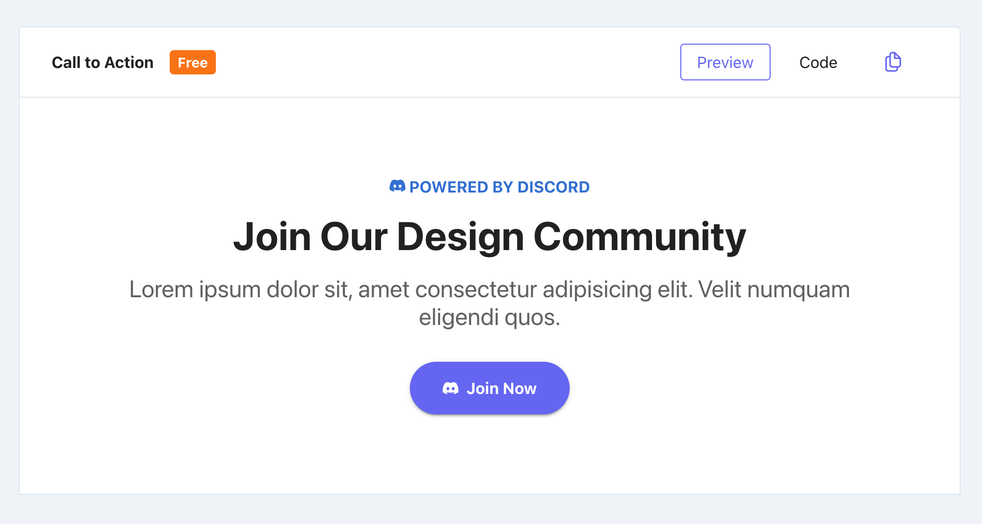
After copying the code, you can add it to your Angular template. Here is an example code of Call to Action block:
<div class="surface-section px-4 py-8 md:px-6 lg:px-8">
<div class="text-700 text-center">
<div class="text-blue-600 font-bold mb-3"><i class="pi pi-discord"></i> POWERED BY DISCORD</div>
<div class="text-900 font-bold text-5xl mb-3">Join Our Design Community</div>
<div class="text-700 text-2xl mb-5">Lorem ipsum dolor sit, amet consectetur adipisicing elit. Velit numquam eligendi quos.</div>
<button pButton pRipple label="Join Now" icon="pi pi-discord" class="font-bold px-5 py-3 p-button-raised p-button-rounded white-space-nowrap"></button>
</div>
</div>
As a result, you will have a nice Call to Action UI block that's ready to use on your web site:

Note: PrimeNG also provide a plenty of free of paid templates that you can apply to create your web applications with a little of modification to suite your business needs such as Sakai (Admin dashboard template).
Summary
I hope that you enjoyed the introduction to the world of fast development with PrimeNG. If you would like learn more about how to work with PrimeNG and Angular, checkout my Next-Level UI Development with PrimeNG book or visit the main PrimeNG website.